The reqstat tool was written to provide a vmstat like output of total web requests happening in real time. This really lightweight monitoring leverages memcached and has a trivial impact for immediate benefit.
  $ ./reqstat 5 5
  epoch,time,rps,avg_req,last,%comp,---,threshold,exceed,last_excess
  1307723122,162522,25,125.92,75.25,48,---,150,9,175.55
  1307723127,162527,24,107.33,6.97,48,---,150,6,188.45
  1307723132,162532,25,118.39,97.63,50,---,150,8,151.37
  1307723137,162537,22,120.51,88.62,42,---,150,5,168.56
  1307723142,162542,26,106.62,6.12,51,---,150,6,167.81
While this is useful, I can see 22-26 requests per second, averaging 106-120 ms, visualizing this gives more information immediately available like:
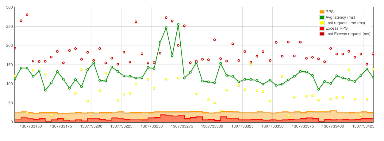
It is easy to look at an average and lose site of the larger picture. What are the outliers, how many are there? Visualizing of larger samples (a later example which will show 10,000 rps across multiple servers) shows that the granularity is also critical.
This graphic is produced with Flot. A very simply javascript library. You can also use gnuplot, an example script is included in github.
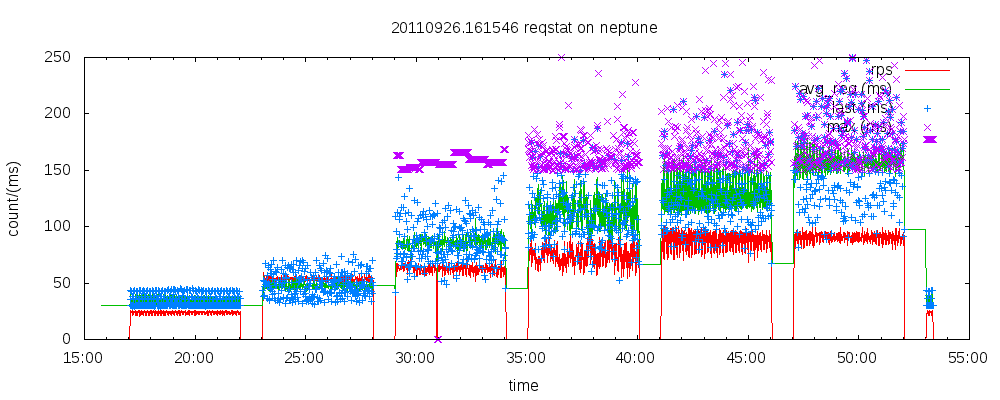
This output is the result of benchmarking, this being generated from reqstat output with a script in my monitor git repository.
 At the closing keynote of the recent
 I will be joining a stellar class of speakers at the