Digital Tech Trek Digest [#Issue 2024.03]

Lessons from going freemium: a decision that broke our business

As an entrepreneur always considering how to produce a sustaining passive revenue, what licensing model to use, and how to acquire and retain customers, the allure of a freemium model is ever present in so many offerings. You may wish to read this article and look at the visualizations provided with the narrative. I found this a useful data storytelling example.

The allure of seeing a new product is the strongest motivator new users have to complete setup. If you make onboarding too easy, they’ll never come back to do the hard task you let them skip.

Read more at Lessons from going freemium: a decision that broke our business Source: TLDR

Newsletters and online content creators

Lenny’s Newsletter from the prior article, listed with over 574,000 subscribers is one of several Substack newsletters I subscribe to. Substack is described as “The subscription network for independent writers and creators”. I have been collecting the number of subscribers from several newsletters I follow, however, there is no way to see that growth over time. Also missing are the price rates over time and the ratio of free to paying subscribers. Random Idea: What is missing is a history of this information. Other stats I’ve noted previously include 66,000 subscribers for Kent Becks Newsletter with 3 subscription plan offerings, 1,250,000 subscribers for the free TLDR (I can remember this years ago being much less) and 65,000 subscribers for the Seattle Data Guy newsletter.

FWIW this post from Lenny’s Newsletter This newsletter is growing up is from 2020.

Golden Kitty Awards 2022

I came across the Golden Kitty Awards, which unfortunately are only current to 2022 (fail on being current). It was interesting to scan the list for innovative ideas. I’ve yet to visit any sites, but I’m always encouraged by what people think of and commit to building, regardless of the motivation or incentive. What counts is an entrepreneur takes an idea and releases a product. 

Source: Random

Streamer JS – Video stream layout manager for OBS Studio and other streaming applications.

I am a new user of Twitch streaming for personal projects.  My good friend Sergey Chernyshev organizer of the large New York Web Performance Group has created Streamer JS as a means to drive more dynamic content in the browser and with common languages of HTML/CSS/Javascript and using OBS more as the streaming only component.  One objective is better version control management of assets/scenes/sources/filters/etc.  It’s interesting that  PouchDB is an eventually consistent distributed datastore in Javascript. Yet another simple data store to review for suitability. 

Source: Word of mouth

The 37th Chaos Communication Congress (37C3) by the Chaos Computer Club

Last month I was introduced to the Chaos Computer Club. This large German-based annual tech conference focuses on security & infrastructure/hacking.  Over 100 talks from the most recent event last week have been posted here.

Source: Word of mouth

About ‘Digital Tech Trek Digest’

Most days I take some time early in the morning to scan my inbox newsletters, the news, LinkedIn, or other sources to read something new covering professional and personal topics of interest. Turning what I read into actionable notes in a short, committed time window summarizes what I learned today, what I should learn and use, or what is of random interest. And thus my Digital Tech Trek.

Some of my regular sources include TLDR, Forbes Daily, ThoughWorks Podcasts, Daily Dose of Data Science and BoringCashCow. Also Scientific American Technology, Fareed’s Global Briefing, Software Design: Tidy First? by Kent Beck to name a few.
Why is my database slow?

Not part of my Don’t Assume series, but when a client states “Why is my database slow””, you need to determine if indeed the database is slow.

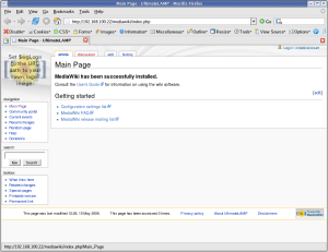
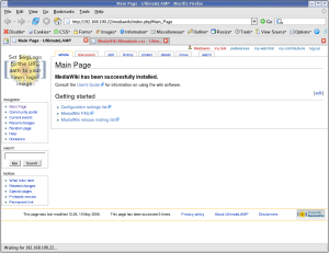
Some simple tools come to the rescue here, one is Firebug. If a web page takes 5 seconds to load, but the .htm file takes 400ms, and the 100+ assets being downloaded from one base url, then is the database actually slow? Tuning the database will only improve the 400ms portion of 5,000ms download.

There some very simple tips here. MySQL is my domain expertise and I will not profess to improving the entire stack however perception is everything to a user and you can often do a lot. Some simple points include:

  • Know about blocking assets in your <head> element, e.g. .js files.
  • Streamline .js, .css and images to what’s needed. .e.g. download a 100k image only to resize to a thumbnail via style elements.
  • Sprites. Like many efficient but simple SQL statements, network overhead is your greatest expense.
  • Splitting images to a different domain.
  • Splitting images to multiple domains (e.g. 3 via CNAME only needed.) — Hint: Learn about the protocol
  • Cookieless domains for static assets
  • Lighter web container for static assets (e.g. nginx, lighttpd)
  • Know about caching, expires and etags
  • Stripping out http://ww.domain.com from all your internal links (that one alone saved 12% of HTML page size for a client). You may ask is that really a big deal, well in a high volume site the sooner you can release the socket on your webserver, the sooner you can start serving a different request.

Like tuning a database, some things work better then others, some require more testing then others, and consultants never tell you all the tricks.

References

As with everything in tuning, do your research and also determine what works in your environment and what doesn’t. Two excellent resources to start with are Steve Souders and Best Practices for Speeding Up Your Web Site by Yahoo.

Restyling a Mediwiki Installation – Lesson 1

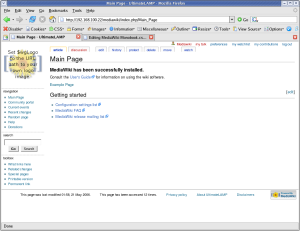
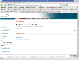
Following my implementation of UltimateLAMP, read heaps more at this thread, I undertook to provide customizations of a MediaWiki Installation. Here is the first lesson that you can undertake if you wish to beautify the default MediaWiki Installation.

For the purposes of this demonstration, I am going to help out Jay & Colin and propose a restyle the MySQL forge to fit in with the default Home Page. Hopefully you will see it there soon!

Lesson 1 – Updating the default Monobook.css

There are several different ways to make style changes, the simplest is to customize the system wide Monobook.css, and this Lesson will focus on this.

By accessing the link [http://my.wiki.site/]index.php/MediaWiki:Monobook.css you will be able to make the following changes.

The best way to approach this, like any good programming style, make small changes, testing and confirmation and continue.

Note: For all screen prints, click for a larger image

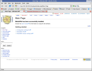
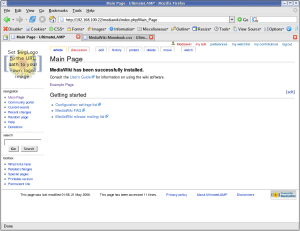
1. Cleanup Backgrounds

body        { background-image: none; background-color: #FFFFFF;}
.portlet    { background-color: #FFFFFF; }

The MediaWiki Page is made up of three sections, these are the represented by styles .portlet, #content, and #footer. For the purposes of our first example, the content section and the footer section are already white.

==>

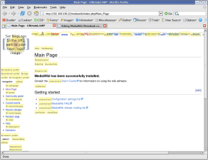
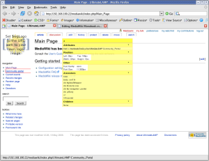
At this point I should recommend that you use FireFox for future work. You should then install the Web Developer Add-on. What results from this plugin is invaluable information about the internals of a web page. The two options most useful for this exercise is:

  • Information | Display Id and Class Details.
  • Information | Display Element Information (move the cursor around to get information)
==>

2. Cleanup Borders

I don’t feel that borders around things are warranted. I’m more a clean look kinda guy. Remove all borders, say one to separate the footer from the page.

#content    { border-width: 0px; }
.portlet .pBody
            { border-width: 0px; }
#footer     { border-top: 1px solid #888888; border-bottom-width: 0px; }
==>

Maybe, that’s a little too clean. Add some separators on left side options.

#p-navigation,
#p-search,
#p-tb       { border-top: 1px dotted #888888; }
==>

3. Links

Using the Forge Styles http://forge.mysql.com/css/shared.css we can adjust the links accordingly.

a:link      { color: #10688E; text-decoration: none; }
a:hover     { color: #003366; text-decoration: underline; }
a:visited   { color: #106887; text-decoration: none; }

a.new:link  { color: #AA0000; text-decoration: none; }
a.new:hover { color: #AA0000; text-decoration: underline; }

==>

4. Content

Ok, we have played around a little, now to move into some more serious changes. Looking at the general page look and feel that you see in most page content.


html,body,p,td,a,li
            { font: 12px/19px Verdana, "Lucida Grande", "Lucida Sans Unicode", Tahoma, Arial, sans-serif; }

h1          { font: bold 24px Helvetica, Arial, sans-serif; color: #EB694A; letter-spacing: -1px;
              margin: 1.5em 0 0.25em 0;
              border-bottom: 1px dotted #888888; line-height: 1.1em; padding-bottom: 0.2em; }

h2          { font: bold 18px Helvetica, Arial, sans-serif;  color: #EB694A; letter-spacing: -1px;
              margin: 2em 0 0 0;
              border-bottom: 1px dotted  #888888; line-height: 1.1em; padding-bottom: 0.2em; }

h3          { font-size: 12px; color: #6F90B5; }

h4          { font-size: 12px; color: #6F90B5; }

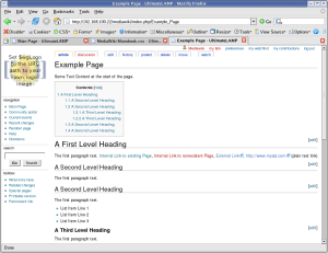
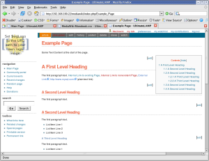
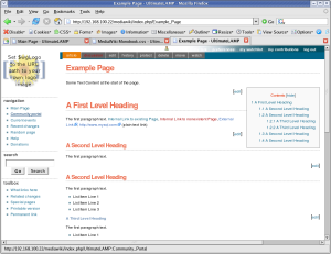
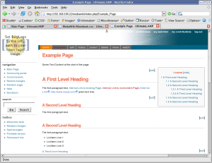
At this time, I’ve created an Example Page to better demonstration of the look and feel, as the default MediaWiki Main page has limited content.

Some Text Content at the start of the page.

= A First Level Heading =
The first paragraph text.
[[Main Page | Internal Link to existing Page]],
[[Nonexistent Page | Internal Link to nonexistent Page]],
[http://forge.mysql.com  External Link],
http://www.mysql.com  (plain text link)

== A Second Level Heading ==
The first paragraph text.

== A Second Level Heading ==
The first paragraph text.
* List Item Line 1
* List Item Line 2
* List Item Line 3
=== A Third Level Heading ===
The first paragraph text.
* List Item Line 1
** Sub Item 1
** Sub Item 1
** Sub Item 1
*** Sub Item 1
*** Sub Item 2
*** Sub Item 3
* List Item Line 2
* List Item Line 3
=== A Third Level Heading ===
The first paragraph text.
# List Item Line 1
## Sub Item 1
## Sub Item 1
## Sub Item 1
### Sub Item 1
### Sub Item 2
### Sub Item 3
# List Item Line 2
# List Item Line 3
== A Second Level Heading ==
The first paragraph text.

== A Second Level Heading ==
The first paragraph text.

==>

5. Table of Contents

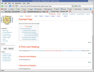
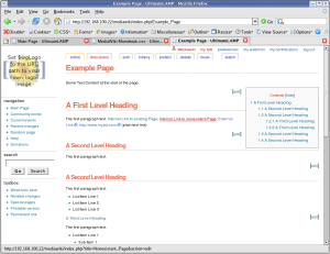
By default, the Table of Contents shows at the top of a page when a given amount of sections or content is present (not sure what the trigger is). The issue is, for larger pages, it means you need to scroll down before you can see any page content. You can disable this with the __NOTOC__ option, but a better solution is to position the Table of Contents so as to not interfere with initial content.

#toc        { float: right; margin: 0 0 1em 1em; border: solid 1px #888888; text-color: #EFEFEF; color: #333333; }
#toc td     { padding: 0.5em; }
#toc .tocindent
            { margin-left: 1em; }
#toc .tocline
            { margin-bottom: 0px; }
#toc p      { margin: 0; }
#toc .editsection
            { margin-top: 0.7em;}
==>

Ok, we are about half way there.

6. Menu Options

In order to get a look and feel like the Forge Home Page., we now have to work on the rest of the navigation options at the top of the page above the content. Let’s start with Second Line of Menu Options (I’ll explain more later why).

#p-cactions { padding-right: 0px; margin-right: 0px; background-color: #006486; width: 100%; top: 77px; }
#p-cactions ul
            { margin: 0; padding: 0; list-style: none;  font-size: 85%; margin-left: 10px; }
#p-cactions li
            { float:left; margin:0; padding:0; text-indent:0; border-width: 0px; }
#p-cactions li a
            { display:block;  color:#F7F7F7;  font-weight: bold;
              background-color: #666666;  border:solid 1px #DDDDDD;
              border-width: 0px;  border-left-width:1px;  text-decoration:none; white-space:nowrap;}
#p-cactions li a:hover
            { background-color: #FFBC2F; color: #666666; }
#p-cactions li.selected a
            { background: #EA7F07;  border:none;}
#p-cactions li.selected  a:hover
            { color: #000000; }
==>

7. Top Menu Options

#p-personal .pBody
            { background: #FFFFFF url(http://forge.mysql.com/img/bggradient.jpg) no-repeat top right; }

#p-personal li a,
#p-personal li a.new
            { color: #FFFFFF; text-decoration: none; font-weight: bold; }
#p-personal li a:hover
            { color: #E97B00; background-color: transparent; text-decoration: underline; }
==>

The down side is it should be the same height at the Forge Page. This required a little more work, and other sections had to be adjusted accordingly, hence why I left this to last. (The size is based on the later mention logo height + margins)

#p-personal { height: 62px; }
#p-personal .pBody
            { height: 62px; }
#p-cactions { top: 62px; }
#content    { margin-top: 84px; }

==>

8. Some Miscellaneous Things

  • Deemphasis the text in the footer a little
  • Remove the annoying arrow that occurs after external links
  • Remove the logo from the login link
  • Hide the My Talk link
#footer     { color: #888888; }
#bodyContent a[href ^="http://"]
            { background:inherit !important; padding-right:inherit !important}
li#pt-userpage
            { background: none; }
li#pt-mytalk
            { display: none; }

==>

The Badging

Let us not forget the final step, the logo badging.

This requires a change to a MediaWiki filesystem file

LocalSettings.php.

$wgLogo             = "http://forge.mysql.com/img/mysqllogo.gif";

And the following Style changes.

#p-logo, #p-logo a, #p-logo a:hover
            { width:100px; height: 52px; }
#p-logo     { margin-left: 10px; margin-top: 5px; margin-bottom: 5px; }

#p-cactions { left: 0px; }
#p-cactions ul
            { margin-left: 180px; }

In order to overcome the top options bleeding to white text on white background, I’ve increased the right side fill of the default bggradient image, replacing the appropriate ULR with the following.

#p-personal .pBody
            { background: #FFFFFF url(/images/bggradient.png) no-repeat top right; }
==>

Conclusion

It’s not quite perfect yet, but this shows how it can be done. Some minor things are left, but I’ve run out of time for the few hours I allocated to this.
The end result of monobook.css for this lesson is:

/* edit this file to customize the monobook skin for the entire site */

/* Background Display */

body        { background-image: none; background-color: #FFFFFF;}
.portlet    { background-color: #FFFFFF; }

/* Borders */

#content    { border-width: 0px; }
.portlet .pBody
            { border-width: 0px; }
#footer     { border-top: 1px solid #888888; border-bottom-width: 0px; }

#p-navigation,
#p-search,
#p-tb       { border-top: 1px dotted #888888; }

/* Links */
a:link      { color: #10688E; text-decoration: none; }
a:hover     { color: #003366; text-decoration: underline; }
a:visited   { color: #106887; text-decoration: none; }

a.new:link  { color: #AA0000; text-decoration: none; }
a.new:hover { color: #AA0000; text-decoration: underline; }

a.external:link {color: #000000; text-decoration: none; }
a.external:hover { color: #AA0000; text-decoration: underline; }


/* Page Look & Feel */
html,body,p,td,a,li
            { font: 12px/19px Verdana, "Lucida Grande", "Lucida Sans Unicode", Tahoma, Arial, sans-serif; }

h1          { font: bold 24px Helvetica, Arial, sans-serif; color: #EB694A; letter-spacing: -1px;
              margin: 1.5em 0 0.25em 0;
              border-bottom: 1px dotted #888888; line-height: 1.1em; padding-bottom: 0.2em; }

h2          { font: bold 18px Helvetica, Arial, sans-serif;  color: #EB694A; letter-spacing: -1px;
              margin: 2em 0 0 0;
              border-bottom: 1px dotted  #888888; line-height: 1.1em; padding-bottom: 0.2em; }

h3          { font-size: 12px; color: #6F90B5; }

h4          { font-size: 12px; color: #6F90B5; }

/* Table of Contents */
#toc        { float: right; margin: 0 0 1em 1em; border: solid 1px #888888; #EFEFEF; color: #333333; }
#toc td     { padding: 0.5em; }
#toc .tocindent
            { margin-left: 1em; }
#toc .tocline
            { margin-bottom: 0px; }
#toc p      { margin: 0; }
#toc .editsection
            { margin-top: 0.7em;}


/* Second Line Top Menu Options */

#p-cactions { padding-right: 0px; margin-right: 0px; background-color: #006486; width: 100%; }

#p-cactions ul
            { margin: 0; padding: 0; list-style: none;  font-size: 85%; margin-left: 10px; }

#p-cactions li
            { float:left; margin:0; padding:0; text-indent:0; border-width: 0px; }

#p-cactions li a
            { display:block;  color:#F7F7F7;  font-weight: bold;
              background-color: #666666;  border:solid 1px #DDDDDD;
              border-width: 0px;  border-left-width:1px;  text-decoration:none; white-space:nowrap;}

#p-cactions li a:hover
            { background-color: #FFBC2F; color: #66666; }

#p-cactions li.selected a
            { background: #EA7F07;  border:none;}

#p-cactions li.selected  a:hover
            { color: #000000; }

/* Top Menu Options */
#p-personal .pBody
            { background: #FFFFFF url(/images/bggradient.png) no-repeat top right; }

#p-personal li a,
#p-personal li a.new
            { color: #FFFFFF; text-decoration: none; font-weight: bold; }
#p-personal li a:hover
            { color: #E97B00; background-color: transparent; text-decoration: underline; }

/* Top Menu Height Adjustments */
#p-personal { height: 62px; }
#p-personal .pBody
            { height: 62px; }
#p-cactions { top: 62px; }
#content    { margin-top: 84px; }

/* Minor Things */
#footer     { color: #888888; }
#bodyContent a[href ^="http://"]
            { background:inherit !important; padding-right:inherit !important}
li#pt-userpage
            { background: none; }
li#pt-mytalk
            { display: none; }

/* Badging */
#p-logo, #p-logo a, #p-logo a:hover
            { width:100px; height: 52px; }
#p-logo     { margin-left: 10px; margin-top: 5px; margin-bottom: 5px; }

#p-cactions { left: 0px; }
#p-cactions ul
            { margin-left: 180px; }

References

User Styles Alternative
Gallery of user styles
Skins
LocalSettings.php Style Information
Navigation Bar
User Rights
Wikipedia Monobook
MediaWiki Skin HowTo