Digital Tech Trek Digest [#Issue 2024.07]

Everything you need to know about seed funding for startups

A recent call with a startup founder funded by TinySeed led me to learn about MicroConf and Rob Walling. (Thanks Tony for the info). This has led to a lot of great info in several new newsletters and videos including this video. A few very valuable tips I learned included the answer to Why should you raise funds at all? The 1-9-90 rule, and different types of funding including Indie funding. It was interesting to find out that the TinySeed accelerator is 1 year, and not 13 weeks, which is common in NY. Rather than sharing my notes, go watch the video.

5 Books That Paved My Path to Entrepreneurial Success

I have not heard of any of these books, and I have such a long list, perhaps I need to publish my list and elicit feedback on prioritizing. The list from this article is as follows:

    1. Mastering negotiations with never split the difference
  1. 2. Embracing risk with skin in the game
  2. 3. Building habit-forming products with Hook
  3. 4. The roadmap to a billion dollar app in How to Build a Billion Dollar App

Visualization

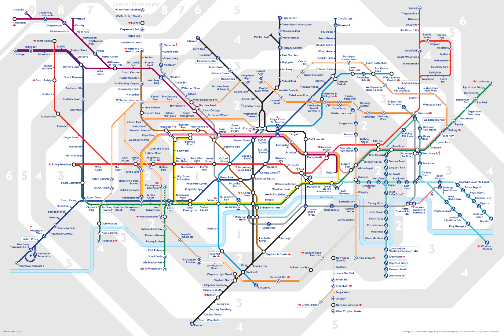
Last week I was at two events in Brussels. I chose to head to London to fly home. I found this map present in many tube stations (The tube is the London Metro Subway). It’s been a decade since I was in London, and over two decades since I lived in the UK. I found the new map great. When I mentioned it as a good visualization, I was surprised that locals of the London area thought it was horrible. I saw the value in the visualization, but perhaps others see it like art, “in the eyes of the beholder”. It could also be “habit”.
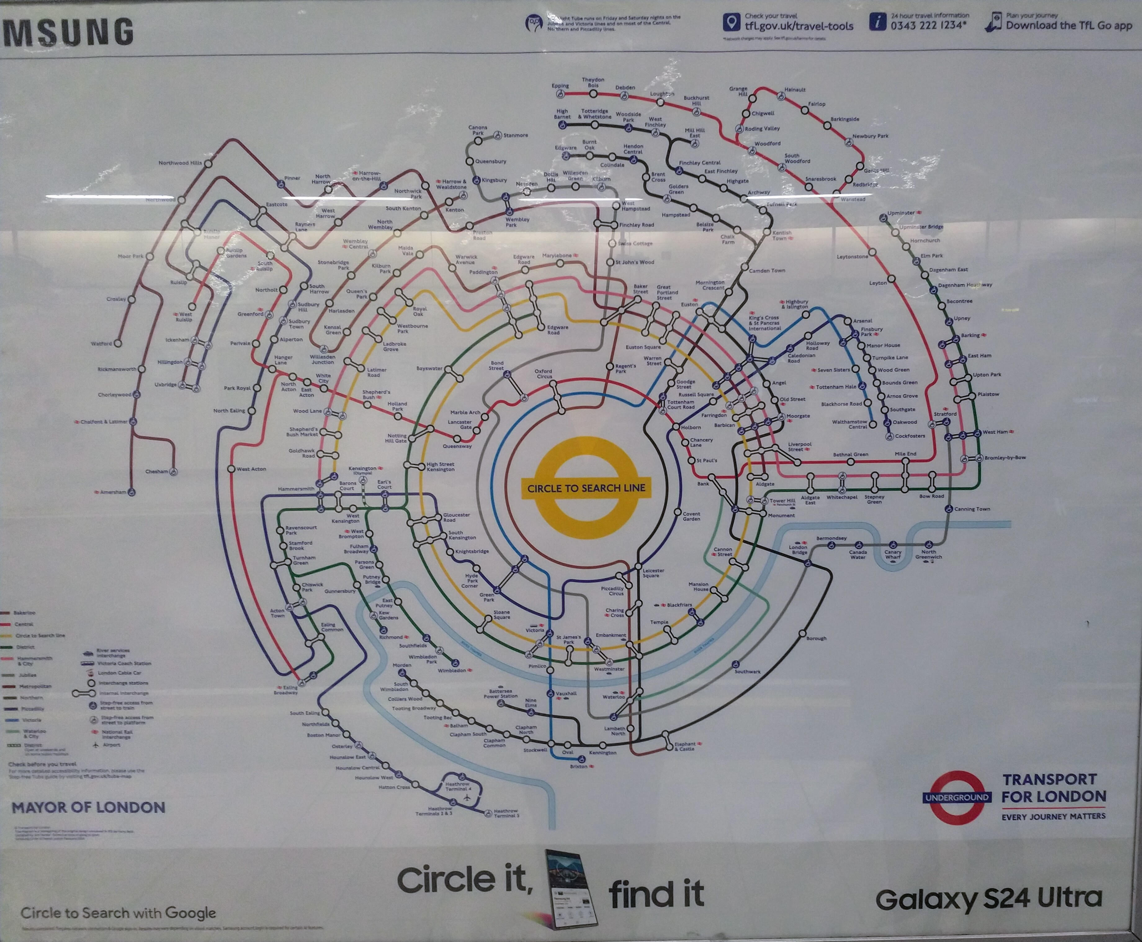
London Tube Map - 2024 presentation
Typical London Tube map

Cats and Dogs

How many *NIX `cat` memes can there be? Well, a lot cat is the most misused thing by programmers new to Linux. I cringe every time someone uses it wrong in a bash script. Thread below with proper uses of cat only.

Hey, dogs, you are in the count also with HTTP STATUS DOGS. My picks are 300 Multiple Choices, and 429 Too Many Requests for me.

Upcoming Events on my radar

About “Digital Tech Trek Digest”

I take some time early in the morning to scan my inbox newsletters, the news, LinkedIn, or other sources to read something new covering professional and personal topics of interest. Turning what I read into some actionable notes in a short, committed time window is a summary of what I learned, what I should learn and use, or what is of random interest. And thus my Digital Tech Trek.

Some of my regular sources include TLDR, Forbes Daily, ThoughWorks Podcasts, Daily Dose of Data Science and BoringCashCow. Also Scientific American Technology, Fareed’s Global Briefing, Software Design: Tidy First? by Kent Beck, Last Week in AWS to name a few.

Random

I shared with a colleague on Feb 9. “3 SQL databases walked into a NoSQL bar. A little while later, they walked out because they couldn’t find a table.”

Digital Tech Trek Digest [#Issue 2024.05]

Because the world needs better dashboards

While my professional interests in Building Better Data Insights Faster rely on using visuals and narratives to show data-driven results, “Starting from first principles” is the question you have to ask. Identifying the quality of data sources, the time to delivery, and the confidence of accuracy are critical aspects of any dashboard.

Source: WrapText by Equals

This is the second article I’ve read about Equals in a week, and while I’m not ready to go back to a spreadsheet, this company has some great previous posts with excellent content, such as the 2023 summary and How to ship fast. An appropriate statement would be.

What a year. We embraced AI. We reimagined BI. We waved freemium goodbye. And as the cliché goes, we’re only just getting started.

[Last Week in AWS] Issue #352: New Year, New You, Here’s December in Review

Damm right, I think you are giving too much created by saying “a year”. More than once I had to rewrite code because AWS was years behind standard Python releases. AWS Lambda adds support for Python 3.12.

Whatever was going on with the delays in getting new language runtimes out a year or more after the language version itself was released seems to have been resolved. I wonder how long it’ll take that unpleasant chapter to fade from the collective awareness around Lambda.

Source: Last Week in AWS

Latency is the new outage

While technically a video that I listened to with Getting Started with ElastiCache for Redis Performance & Cost Optimization, this needs to be a slogan used more frequently. It is so true. The speaker in the opening minutes also describes some compelling reasons why our proliferation of data can contribute to a negative impact.

Source: Random AWS reading.

About “Digital Tech Trek Digest”

Most days I take some time early in the morning to scan my inbox newsletters, the news, LinkedIn, or other sources to read something new covering professional and personal topics of interest. Turning what I read into some actionable notes in a short, committed time window is a summary of what I learned, what I should learn and use, or what is of random interest. And thus my Digital Tech Trek.

Some of my regular sources include TLDR, Forbes Daily, ThoughWorks Podcasts, Daily Dose of Data Science and BoringCashCow. Also Scientific American Technology, Fareed’s Global Briefing, Software Design: Tidy First? by Kent Beck, Last Week in AWS to name a few.

Can a picture replace a text description?

Data visualization, data storytelling, and data lineage are all ways to better describe and visualize a specific situation for a set of data. Generally, I find these techniques are used as a means to uncover or identify information that ultimately pertains to individuals. For example how many sales have we made across time/location/business unit? How many customers do we have? How many social media photos has a person provided over a period of time? Unfortunately, this is not the kind of data that I feel has real-world meaning to me. It doesn’t describe the advancements made in the biomedical field to help fight disease, it doesn’t tell us the amount of energy that we have saved or the amount of energy that we failed to collect and the impact that has locally and globally on our world, or it doesn’t describe valuable human experiences in history about people and places. I find this value in data visualizations of others.

During a recent vacation, I thought about the impact of the visualization of my experiences and just how much information was not collected, and how much information was collected but is of average or poor value or is extremely valuable. How hard it was to collate even what I had collected, and to who or what the value of this information is? While these are personal experiences and not that of a commercial organization, Google certainly informed me of how many people were viewing a public image I uploaded and a comment I made of an iconic Australian location and food.

Inaccessible value in a text description

I recently caught up with a very dear friend. She had lost her husband 10 years ago after more than 50 years of marriage. He kept a written diary every year since 1946, starting a year after the end of world war II that he served it.

So from 1946 to 2012, that is 66 years, there is a wealth of information that includes personal feelings, expectations, and perhaps thoughts about what is going well and what’s not going well. It would also include valuable information about the world view from a very intelligent and influential individual. These diaries are still located today on the same shelf in the same office they have for the short 25 years I was aware.

To draw a conclusion to the question with a data analogy. A single copy, in a single location of un-indexed information, which first-hand sources know has unlocked potential. It is also an immutable and finite time capsule. It would also IMHO contain great value in feelings, emotions, family, and history that is important to a small community. Could a picture represent this data?

A picture

Whilst traveling I used my camera as a means to record the experiences that I was having with my family. I am a photographer and not a videographer so my expression is a picture rather than a video and optionally audio. Sidebar, we did give our child a diary for this vacation to write in, however the attempt to build this new habit only lasted 2 days. Forming new habits can be hard.

But can a picture relay adequate information to describe when and where this photo was taken, why it was taken, how I felt, who I was with, what did it inspire, how did it make me think about related experiences in the past.

Today there is technology now that can take a picture and describe the contents, effectively it could create a summarized description of the picture. With additional metadata such as Exif data where you can extract more details such as time and location. With machine learning you can do picture comparison to identify locations even if location was not specified with the photo.

You can now have AI create an image from a description, if only my Dall-E-2 account would not keep crashing I would try it out.

A picture on its own only contains some value. If you collect all this information and combined with other sources, for example when I used my phone and not my camera, this is stored use google photos. This company can use this information to create a timeline of where you were, when you were there, perhaps you were with and combined with all the sources this company has such as your Google calendar, and Gmail it can and does create a timeline much like the timeline you see in social media platforms such as Facebook if you are regularly user of such a platform.

So we have not a picture, but a collection of pictures, including those not taken or owned by yourself, combined with other structured and unstructured data that can provide an improved timeline.

In comparison in data visualization there is usually a time component for most data. Animated data visualizations which can be awesome usually represent data across time.

Example pictures

Let me give you some simple images as an example and I’ll add some information that is not included in the photos specifically what is available in today’s modern technology such as GPS location. First my existing EOS 5D camera does not provide that information and second I do not enable that on my phone because I want to keep that information private and Google does not provide a capability that would enable me to store personal information but do not share that information for consumption by for example use that information for other machine learning capabilities.

Emu

I had never seen an emu roaming in the wild in Australia before this trip. From a conversation with a friend on a different topic did she provide information that driving between Jeriderie and Narandera you will find emus in the wild. Indeed we did multiple times on this specific highway without having to randomly goto some isolated place hoping for the same outcome.

This is a truly unique animal without only an ostrich looking similar.
Emu in nature, NSW Australia

AWS Rekognition output with values >90% categorize this photo with Antelope, Animal, Mammal, Wildlife, Bird, Sheep, with parents categories of Wildlife, Mammal, Animal. Well that is horribly wrong. An Antelope has 4 legs, this clearly has 2. An Emu is not a Mammal.

AWS Rekognition Response – August 2022. Larger version

That was so bad (and unexpected) I wanted to give the technology another chance with a different emu pic.
Emu in nature, NSW Australia
This time AWS Rekognition output with values >90% describe this photo with Bird, Animal, Emu, Sheep, Mammal, and at 88% Antelope and Wildlife. So if you get Emu (that has two legs), why would you say Sheep which is 4 legs and not a bird? And if you said Emu and Bird, why would you then select Antelope, also with 4 legs, but so not a Bird.

AWS Rekogintion Response – August 2022. Larger version.

Feeling a bit duped by technology, I tried Google Image search next. The first image was recognized as “Tasmanian Emu”. I didn’t know there was such a thing, but it did say Emu and all other related visual matches were Emu. I was surprised it only picked 3 of the 4 animals in the first pic.

The second image was recognized as “Tasmanian emu”, “Emu” and “Common ostrich”. Doh!

Platypus

This next image I was confident AWS Rekognition would be spot on. It’s even a more unique animal, and there are no grass or obstacles to obscure the animal. Boy was I wrong.

Platypus in nature, Eungella QLD Australia

AWS Rekognition output with values >90% describe this photo with Wildlife, Animal, Mammal and at 87% Hippo. It is true that a Hippo is a mammal, and you do find them in water, but?

Platypus in nature, Eungella QLD Australia
Finding an even more evident picture that anybody would recognize, well the software could not. Wildlife, Animal, Mammal. At 85% Lizard, Reptile and Otter. A lizard is not a mammal?

This post is starting to turn into a self proposition even more than I thought.

Had I provided GPS, it would have said Eungella, QLD and any more additional searching would show that it’s a popular destination for finding a Platypus in nature. In-fact a precise GPS location would give the name literally as “Platypus Deck”. here. A human would quickly articulate this by reading text from basic online searches.

Would AWS Rekognition discount values responses if it could know the precise location or even the country. Somehow I feel not.

For what it’s worth, a Google Image Search of Platypus yields tons of pictures AWS should use in it’s recognition validate and ML model.

What this image does not say with whom I was traveling with, that is a local of the area and his comment that in 20 years I’ve not seen platypus as easily and playful as this. It would not describe that on social media, many locals were surprised with the quality of images and videos. It would also not describe what the video shows, how they dive and then burrow into the muddy water using their bill, then rise to the surface and dive again.

Trying Google Image search again, the first image yielded platypus which it is. For the second image, google found no results. Again, I was rather shocked in comparison to the images of platypus a Google Image search shows and the fact this second image showed more detail IMO.

If I correctly label this image with alt text as a platypus, will Google Image search in future show this within search results, or will the output of correct recognition improve at a later time.

Other animals

At this time I decided to give up on animals. An echidna is a unique animal unlike almost any other, a quokka is also, but does resemble a small kangaroo. I do have a hippo, I’ll have to try that out.

Other images

I decided to try some more easier images and I was again overall disappointed and therefore decided to stop adding content here after these two images.

Surfers during summer waves in Oahu

AWS Rekognition above 90% accuracy was Sea, Ocean, Water, Nature, Outdoors, Person, Human, Surfing, Sea Waves, Sport, Sports.
Google Image search gave the first visual response as Viewing summer Swells on Oahu, which is spot on. It was Oahu, not Maui (wonders if I have a surfer image from Maui), and it was more importantly in Summer and not winter which has much larger waves.

Finally I tried to pick one of the most uniquely observable images that you will only find in one location and this image also included readable text.
U.S.S Arizona Memorial at Pearl Harbor Hawaii

AWS Rekognition above 90% was Flag, Symbol, Watercraft, Vessel, Vehicle, Transportation, Waterfront, Water, with Ferry and Boat being 88%. Rather shocked it could not pull out not 1 but 2 specific and clear areas of text and used this. The visible text is “U.S.S ARIZONA MEMORIAL” and “USS ARIZONA BB 39″.

Google Image search described this image as the Pearl Harbor National Memorial which is exactly what it is (in summary).

Even a picture of the Sydney Opera House, a truly unique building did not yield the result of Sydney via AWS Rekognition.

I look forward to this post being indexed to see if Google can give the source of the image as my site. I am also going to have to look into Google APIs for image recognition rather then the very slow and painful web browser option.

In conclusion

To return to the question of this post. Can a picture replace a text description? In short, no. A picture can summarize and quickly convey meaning simply because of how our mind processes visuals but it cannot replace a full text description.

In these examples I would expect almost every reader to be about to summarize these images more accurately, whereas (accessible) machine learning has a very long way to go. Even with location information, only some people would be able to add additional value or better infer an initial description, however all the information I could convey that is of applicable value is not within the picture itself. You cannot interpret additional meaning and value without more context, or without intrinsic knowledge. Using the surfers example, you can find waves used by surfers all around the world. In Oahu specifically in summer, surfable waves are infrequent and small, whereas in winter apparently they are very different.

With data storytelling, a data visualization is going to provide a similar outcome. Better visualizations will contain color and legends that visually describe information more clearly. They will also offer additional insights in creative ways, such as magnifications or clear differentiators. Should photographs as these shown here, automatically contain further context that is shown just in the image. Should image recognition automatically suggest titles that can be further edited by the author? Should an audio summary of the image be able to be recorded with the image? Should any single picture use context of other pictures around locality or time or similarities in the view to build a better picture. It is interesting to consider how technology could improve to provide greater value to the consumer.

How much text is needed is an entirely different question. Is the saying “A picture is worth a 1,000 words” approximately accurate?

Even a complex picture that takes months to review all the detail does not replace a full text description. If you would like an example for comparison checkout the “L. Tellier Kitchen Poster”. A piece of art that I own.

Visualizing reqstat

The reqstat tool was written to provide a vmstat like output of total web requests happening in real time. This really lightweight monitoring leverages memcached and has a trivial impact for immediate benefit.

  $ ./reqstat 5 5
  epoch,time,rps,avg_req,last,%comp,---,threshold,exceed,last_excess
  1307723122,162522,25,125.92,75.25,48,---,150,9,175.55
  1307723127,162527,24,107.33,6.97,48,---,150,6,188.45
  1307723132,162532,25,118.39,97.63,50,---,150,8,151.37
  1307723137,162537,22,120.51,88.62,42,---,150,5,168.56
  1307723142,162542,26,106.62,6.12,51,---,150,6,167.81

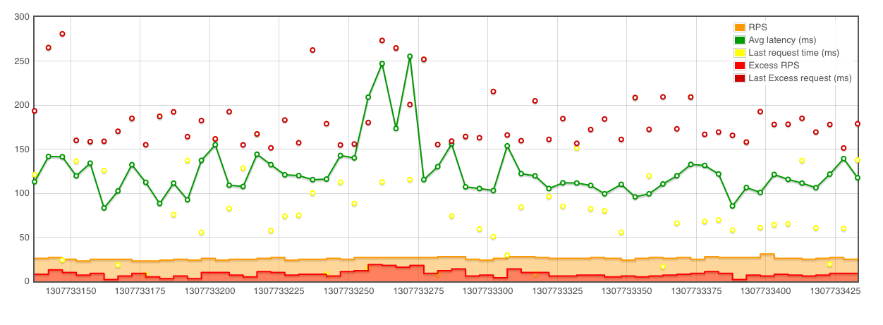
While this is useful, I can see 22-26 requests per second, averaging 106-120 ms, visualizing this gives more information immediately available like:

It is easy to look at an average and lose site of the larger picture. What are the outliers, how many are there? Visualizing of larger samples (a later example which will show 10,000 rps across multiple servers) shows that the granularity is also critical.

This graphic is produced with Flot. A very simply javascript library. You can also use gnuplot, an example script is included in github.

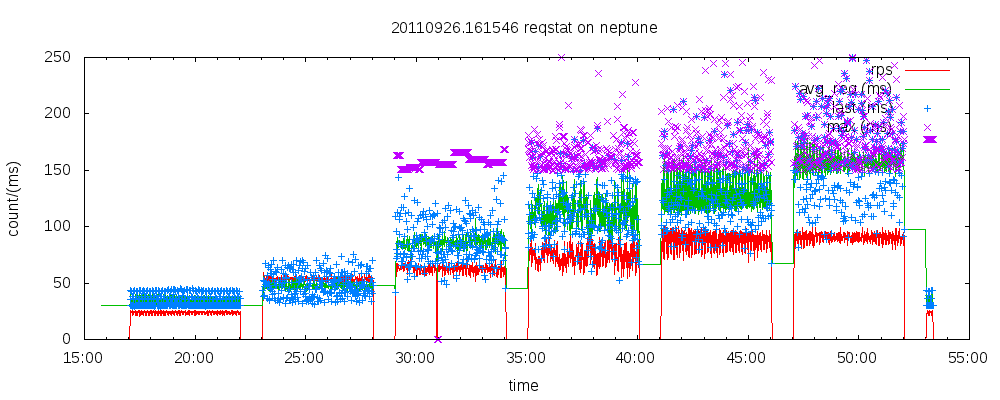
This output is the result of benchmarking, this being generated from reqstat output with a script in my monitor git repository.

Visualizing crowd sourcing data

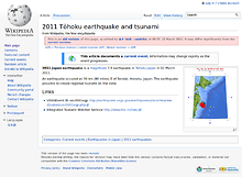
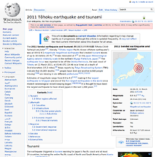
At the closing keynote of the recent Strata Summit in New York, O’Reilly Media founder Tim O’Reilly showed a representation of crowd sourced data on Wikipedia of the 2011 Tōhoku earthquake and tsunami, showing a before and after picture of the page. While interesting, it did not represent what could be shown with the data.

Using the Wikipedia API’s, some features of my VisMarks startup I was able to create a better representation showing an animation of the article over time. While this Wikipedia Earthquake Animation (on a different page for loading) shows a representation of the first 1,000 revisions it highlights one cool way visualize crowd sourced data. Pay particular attention to the new language articles introduced, the images and table of contents as different types of data being added.

While the likes of Twitter and Facebook can provide a stream of information on an emerging event, Wikipedia is unique in that individuals contribute to a single source of combined information. This removes all the noise of duplication. It does not remove the CRUD, however as seen in this article this is quickly removed by others in the community.

It is also cool to see the size of the article grow over time. Below is a graph of the first 24 hours.

These are simple examples of using public API’s and simple tools (in this case, imagemagick,gnuplot and some shell scripts) to tell a story with data visualization.