Clean data is one of those terms everyone uses and few define precisely. Row counts match? No nulls in key columns? Values within expected ranges? All useful checks — and all insufficient once you move from a table view to a visualization view.
I have been capturing real-time vehicle position data from Translink , Queensland’s public transport authority covering bus, train, ferry, and tram services across South East Queensland. The feed reports GPS fixes for active vehicles — latitude, longitude, timestamp, route, and trip identifiers — polled continuously and stored in DuckDB for analysis.
On paper, the data looks straightforward. Each row is a position fix. Filter by route, group by trip, order by timestamp, connect the dots. What could go wrong?
The naive query
Here is the query I expected would produce all reported points for a route trip, rendered as a line geometry. This is a query that is easy to hand write, using a simple table and where qualifications:
SELECT trip_id, route_id,
       ST_MakeLine(list(ST_Point(lon, lat) ORDER BY ts)) AS geom
FROM   positions
WHERE  split_part(route_id, '-', 1) = '999'
AND    lat IS NOT NULL
AND    trip_id = 'SUN 26_27-12345'
GROUP BY trip_id, route_id
For a single trip, the result looks reasonable. The bus runs through the Caloundra area on the Sunshine Coast — the line follows roads towards the town centre. The lines are not precise with roads due to the 30 second interval of reporting data.
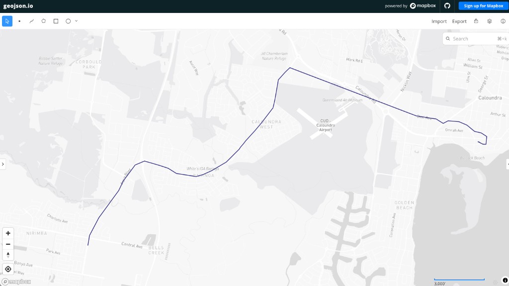
Single trip — the naive query works fine.
Revise the same query to show all trips on the bus route over a 24 hour period and export the geometries to geojson.io for visualization:
SELECT trip_id, route_id,
       ST_MakeLine(list(ST_Point(lon, lat) ORDER BY ts)) AS geom
FROM   positions
WHERE  split_part(route_id, '-', 1) = '999'
AND    lat IS NOT NULL
GROUP BY trip_id, route_id
The map tells a different story.
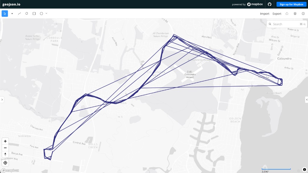
All trips — same query, same data, wrong picture.
Instead of parallel bus routes following the road network, the map shows a star-burst pattern — long straight lines radiating from end points and into the town centre. Lines cut across blocks, over the airport runway, and through areas with no roads at all.
The table view showed nothing obviously wrong. Every row had valid coordinates, plausible timestamps, and consistent trip identifiers. Clean in the table, unusable on the map.
What the visualization revealed?
The star-burst pattern is a classic symptom of chronologically ordered points that should not be connected. ST_MakeLine with ORDER BY ts draws a segment between every consecutive pair of fixes. If an early fix belongs to a different physical journey than the rest, one spurious segment connects the depot to the real route — and when many trips share the same depot, overlaid together, you get the spider-web effect.
The question is not whether the data is “dirty” in an abstract sense. The question is whether it is fit for the purpose of line visualization — and that requires understanding why the outliers exist.
Writing the corrected SQL manually would mean:
- Hypothesising duplicate rows, recycled trip IDs, or overlapping poller runs
- Running diagnostic queries to rule each hypothesis in or out
- Identifying the actual cause — stray idle-vehicle fixes tagged with the next trip ID
- Choosing a gap threshold to split contiguous segments
- Rebuilding the query with deduplication, gaps-and-islands segmentation, and minimum point counts
Each step is straightforward. The combination takes time — especially when the first three hypotheses turn out to be wrong.
Diagnosis with AI assistance
I asked: “How do we improve the all trips query to produce cleaner lines?” — with the star-burst map attached.
Before recommending a fix, the assistant ran diagnostic queries against the actual dataset. Here is some of the engagement:
- Not duplicate rows — only 143 exact
(vehicle_id, ts)duplicates in 463k rows, negligible - Not recycled trip IDs — each
trip_id/route_idcombination maps to exactly one vehicle and one date - Stray idle-vehicle fixes — vehicles get tagged with the next
trip_idwhile still parked at the depot, sometimes over an hour before the real trip starts. One trip showed a 4,009 second (67 minute) gap between the first fix and the rest - The gap distribution split cleanly at 180 seconds: 570 normal inter-fix gaps at 60 seconds or less, versus 20 clear outliers above 180 seconds, with nothing ambiguous in between. This is the same signal an existing
max_gap_msummary column already surfaced — the fix applies the same idea to line-building.
The corrected query
The resulting SQL — which would have taken considerably longer to arrive at manually but was easily generated by Claude Code first time:
WITH deduped AS (
    SELECT * EXCLUDE (rn) FROM (
        SELECT *, row_number() OVER (PARTITION BY vehicle_id, ts) AS rn
        FROM positions
        WHERE split_part(route_id, '-', 1) = '999' AND lat IS NOT NULL
    ) WHERE rn = 1
),
gapped AS (
    SELECT *,
           epoch(ts - lag(ts) OVER (PARTITION BY trip_id ORDER BY ts)) AS gap_s
    FROM deduped
),
segmented AS (
    SELECT *,
           sum(CASE WHEN gap_s > 180 THEN 1 ELSE 0 END)
               OVER (PARTITION BY trip_id ORDER BY ts
                     ROWS UNBOUNDED PRECEDING)::INTEGER AS segment_id
    FROM gapped
)
SELECT trip_id, route_id,
       ST_MakeLine(list(ST_Point(lon, lat) ORDER BY ts)) AS geom
FROM segmented
GROUP BY trip_id, route_id, segment_id
HAVING count(*) > 5
Three transformations:
- Deduplicate exact
(vehicle_id, ts)repeats from overlapping poller runs - Segment each trip into contiguous runs wherever the gap since the previous fix exceeds 180 seconds — a gaps-and-islands pattern
- Filter to segments with more than five points, dropping short stragglers that are almost always depot idle fixes
The result:
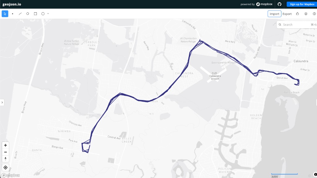
All trips after deduplication, gap segmentation, and minimum point filtering.
Parallel routes following the road network. No star-bursts. No lines through the airport. The same underlying data — cleaned for the visualization purpose.
Table clean vs. visualization clean
This example illustrates something I keep returning to in my dataset curation work :
| Check | Table view | Visualization view |
|---|---|---|
| Valid coordinates | Pass | Pass |
| Non-null timestamps | Pass | Pass |
| Consistent trip IDs | Pass | Pass |
| Chronologically ordered | Pass | Pass |
| Physically contiguous fixes | Not checked | Fail — stray depot points connected to active routes |
| Fit for line geometry | Not checked | Fail — star-burst artifacts |
Clean data is purpose-dependent. The Translink feed is accurate for tracking where a vehicle is at a given moment. It was never designed to produce continuous route lines without transformation. The idle-vehicle tagging is correct behaviour for a real-time tracking system — a vehicle assigned to the next trip while still at the depot is exactly what you would expect. It only becomes “bad data” when you connect those points into a line.
The naive SQL was easy to write. The corrected SQL required understanding the domain — knowing that GPS feeds tag future trips early, that gap thresholds separate idle periods from active travel, and that visualization exposes failures that aggregation hides. AI accelerated the diagnostic loop dramatically: hypothesis, test, reject, refine — in minutes rather than an afternoon of manual exploration.
Where this fits
This is the other side of the dataset story from my recent posts on curated MySQL datasets and DuckDB datasets with AI . Static reference datasets like GeoNames need schema design and load scripts. Real-time feeds like Translink need continuous cleaning rules that depend on how you intend to use the data — tables, maps, aggregations, or alerts each impose different standards.
The visualization layer is not optional decoration. It is often the fastest way to discover that your data is not as clean as you thought.
![Digital Tech Trek Digest [#Issue 2024.07]](https://ronaldbradford.com/images/blog/2024-digital-tech-trek-digest.png)