 At the closing keynote of the recent Strata Summit
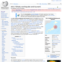
in New York, O’Reilly Media founder Tim O’Reilly showed a representation of crowd sourced data on Wikipedia of the 2011 Tōhoku earthquake and tsunami
, showing a before and after picture of the page. While interesting, it did not represent what could be shown with the data.
At the closing keynote of the recent Strata Summit
in New York, O’Reilly Media founder Tim O’Reilly showed a representation of crowd sourced data on Wikipedia of the 2011 Tōhoku earthquake and tsunami
, showing a before and after picture of the page. While interesting, it did not represent what could be shown with the data.
Using the Wikipedia API’s, some features of my VisMarks startup I was able to create a better representation showing an animation of the article over time. While this Wikipedia Earthquake Animation (on a different page for loading) shows a representation of the first 1,000 revisions it highlights one cool way visualize crowd sourced data. Pay particular attention to the new language articles introduced, the images and table of contents as different types of data being added.
While the likes of Twitter and Facebook can provide a stream of information on an emerging event, Wikipedia is unique in that individuals contribute to a single source of combined information. This removes all the noise of duplication. It does not remove the CRUD, however as seen in this article this is quickly removed by others in the community.
It is also cool to see the size of the article grow over time. Below is a graph of the first 24 hours.
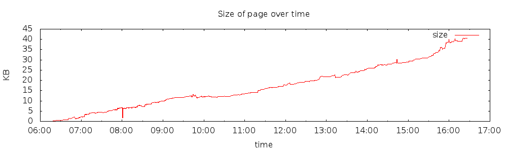
These are simple examples of using public API’s and simple tools (in this case, imagemagick,gnuplot and some shell scripts) to tell a story with data visualization.